Color Maps
By default, NEON comes with two color maps to represent signal measurements: Viridis and Jet. While both color maps are widely used, they may not be the best in all situations. The color map tool allows users to create custom color maps to suit their specific purposes. Custom color maps can be particularly useful to single out a specific range of signal strengths.
Main Window
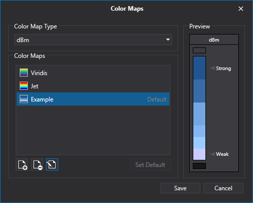
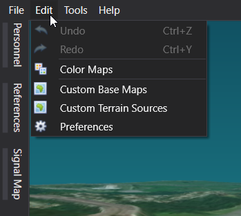
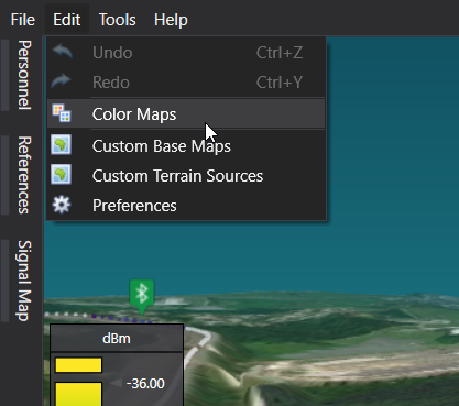
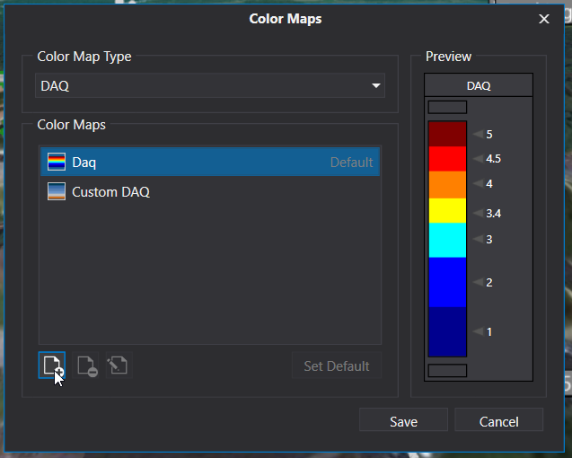
To view and edit color maps, click “Edit->Color Maps”. This will bring up a new window that lists the available color maps. A different set of color map types will be available depending on the type of signal data being collected. Selecting a different type from the top of the window will display the list of color maps available for the selected color map type.
Select one of the color maps to view a preview on the right side of the window. The preview scale shows the color map along with marked intervals. The boxes above and below the scale indicate the colors that represent values above or below the maximum and minimum of the scale.
The Viridis and Jet color maps are interpolated and have a continuous change in colors throughout signal values. Note that these default color maps cannot be edited or deleted. Custom color maps are not interpolated but instead have colors assigned to a range of values. To edit or delete a custom color map, select it and then click the appropriate button in the bottom left of the window.
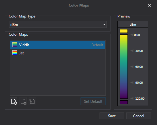
In order to use a color map when viewing a signal map, it must be set as the default. To do this, select the color map, click “Set Default”, and then click “Save”. Note that each color map type has a unique default setting.
Creating a Color Map
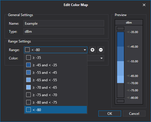
To create a new color map, first select a color map type from the drop-down and then click the “Add Color Map” button in the bottom left of the window. This will bring up a new window called “Edit Color Map.” To start, fill in the required name field.
The next step is to add all of the necessary measurement ranges, which is done by adding transition points. A transition point is a value at the beginning or end of a range. Click the “Add Transition Point” button and then enter a value in the window that pops up. Continue adding transition points until they are all set, including the maximum and minimum of a range. Once the transition points have been set, the ranges will appear in the “Range” drop-down menu. There are always ranges included for values outside of the highest and lowest transition points.
After all of the ranges have been added, a color can be set for each one. First, select a range from the drop-down and click on the color drop-down. This drop-down contains a default palette to choose from. Once a color has been set, it will appear in the preview pane and the “Range” drop-down menu. If a color is not set for a range, it will appear transparent.
For a custom color click the “More Color” option at the bottom of the “Color” drop-down menu. In the new window, enter the RGB values as well as the Alpha value for transparency. Other color formats are accepted such as CMKY, HLS, and HSB.
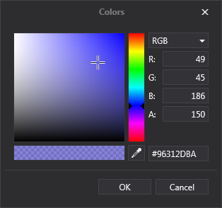
TIP: Use the alpha value to make semi-transparent colored dots in signal maps.
Additionally, a label can be added for each range. The label can be no more than six characters long. Once a label has been added, only labeled points will be visible on the color map preview instead of the transition points.
After coloring and labeling ranges as needed, click “OK” to return to the main window. Future edits can be made by selecting the color map and clicking “Edit Color Map” in the bottom left. To use the new color map, select it, click “Set Default”, and then click “Save”.